Before anyone reads your pitch deck or visits your site, they've already formed an opinion of your business. We design the visual identity that opinion is built on — logo, color, type, and everything it touches.
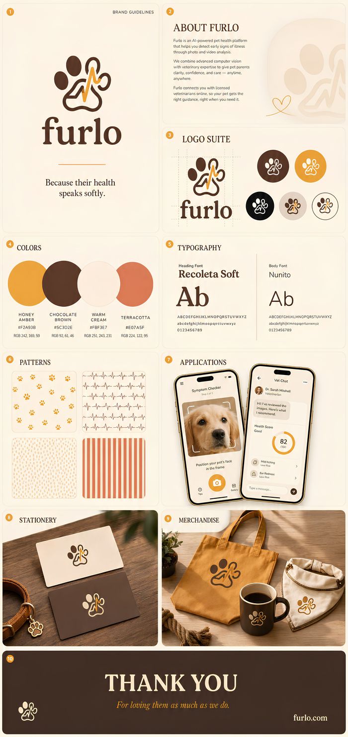
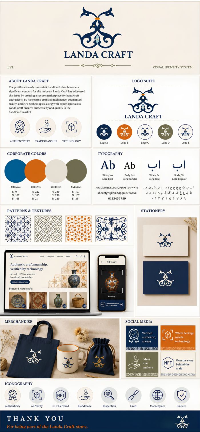
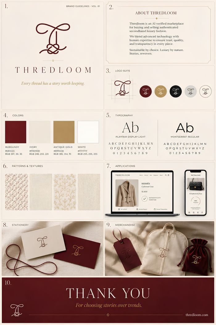
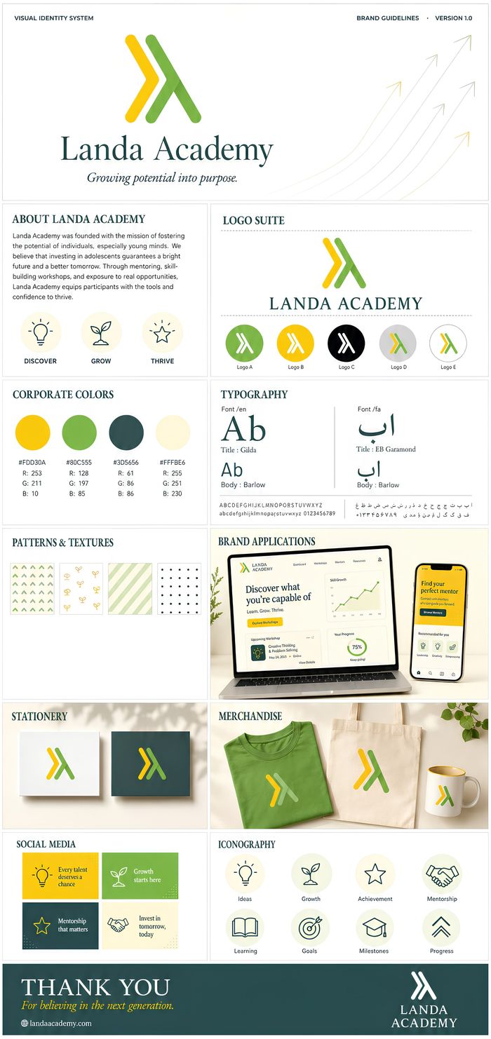
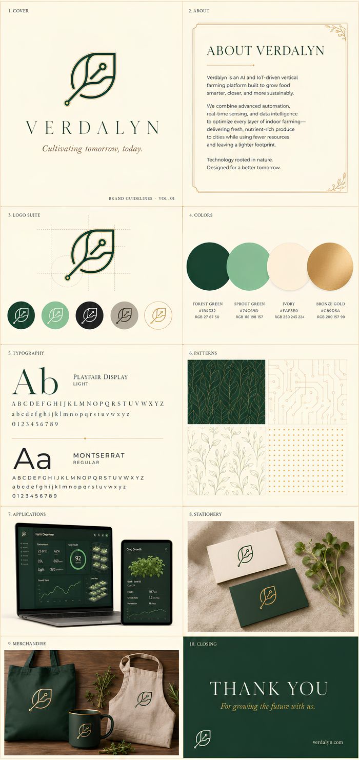
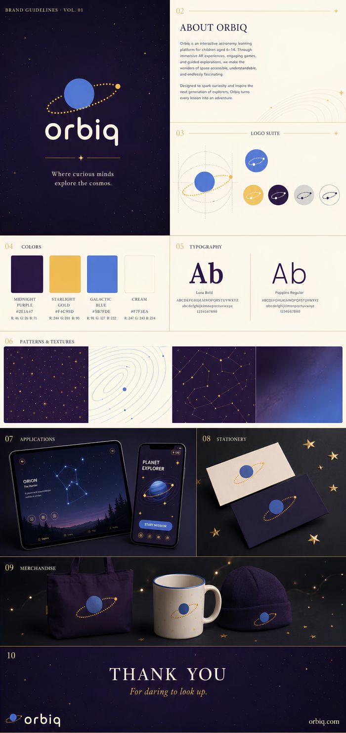
A curated collection of 9 identity systems — logo designs, brand systems, typography and application mockups. Click any card to inspect full details.
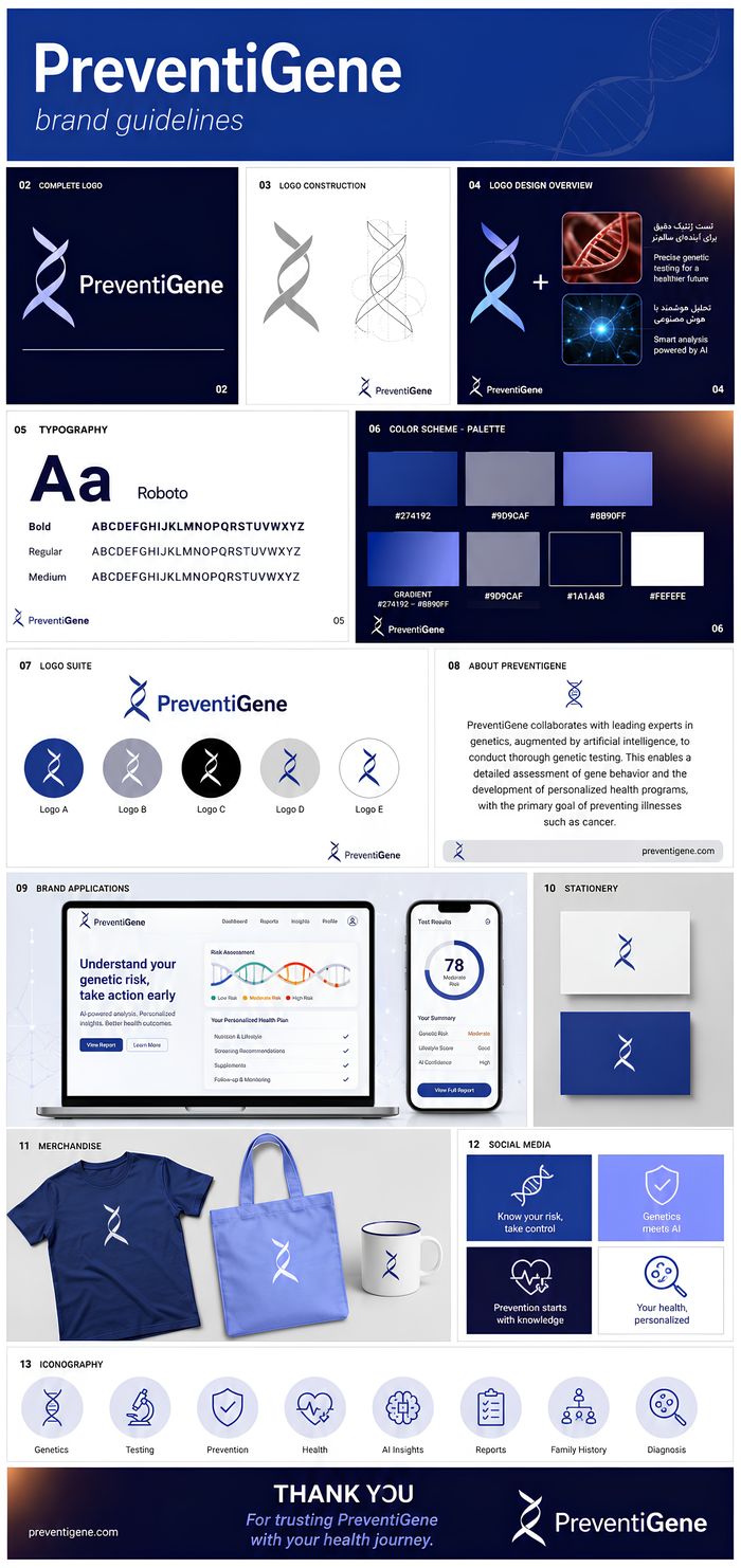
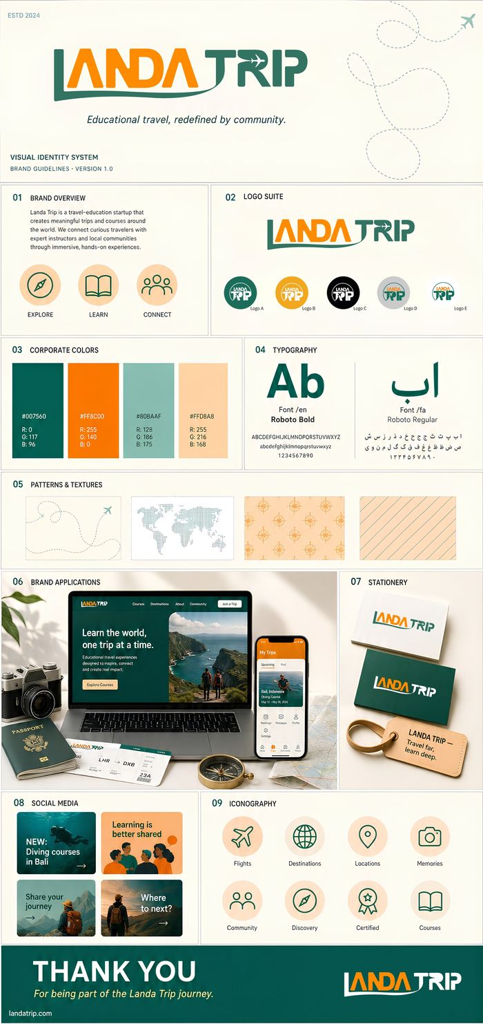
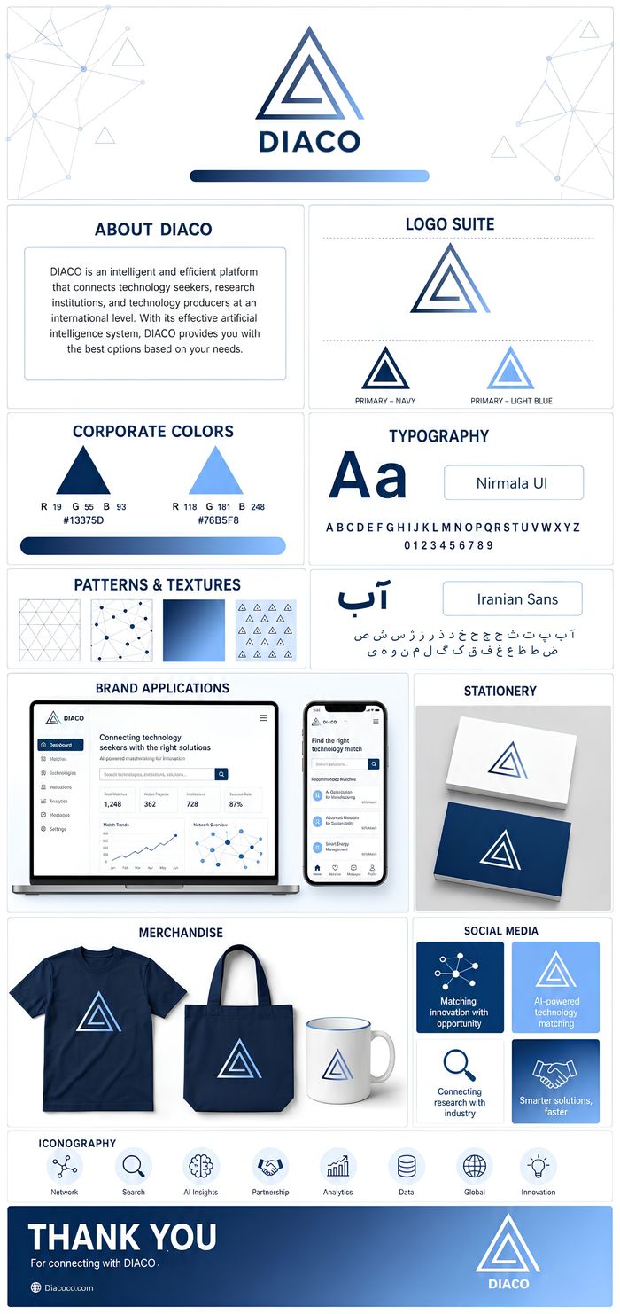
01/10
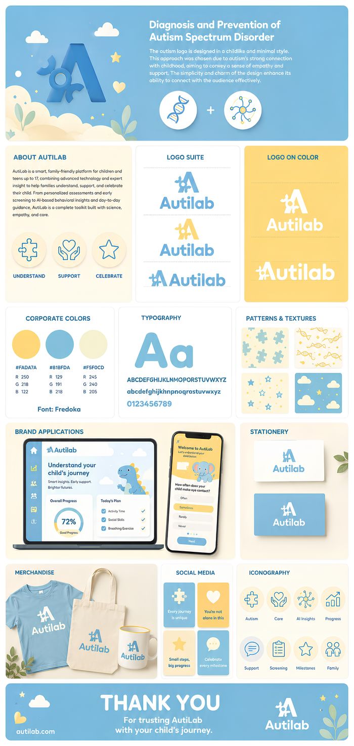
A complete identity is a system, not just a logo. Here's every component that makes the AutiLab brand work — mapped and explained.
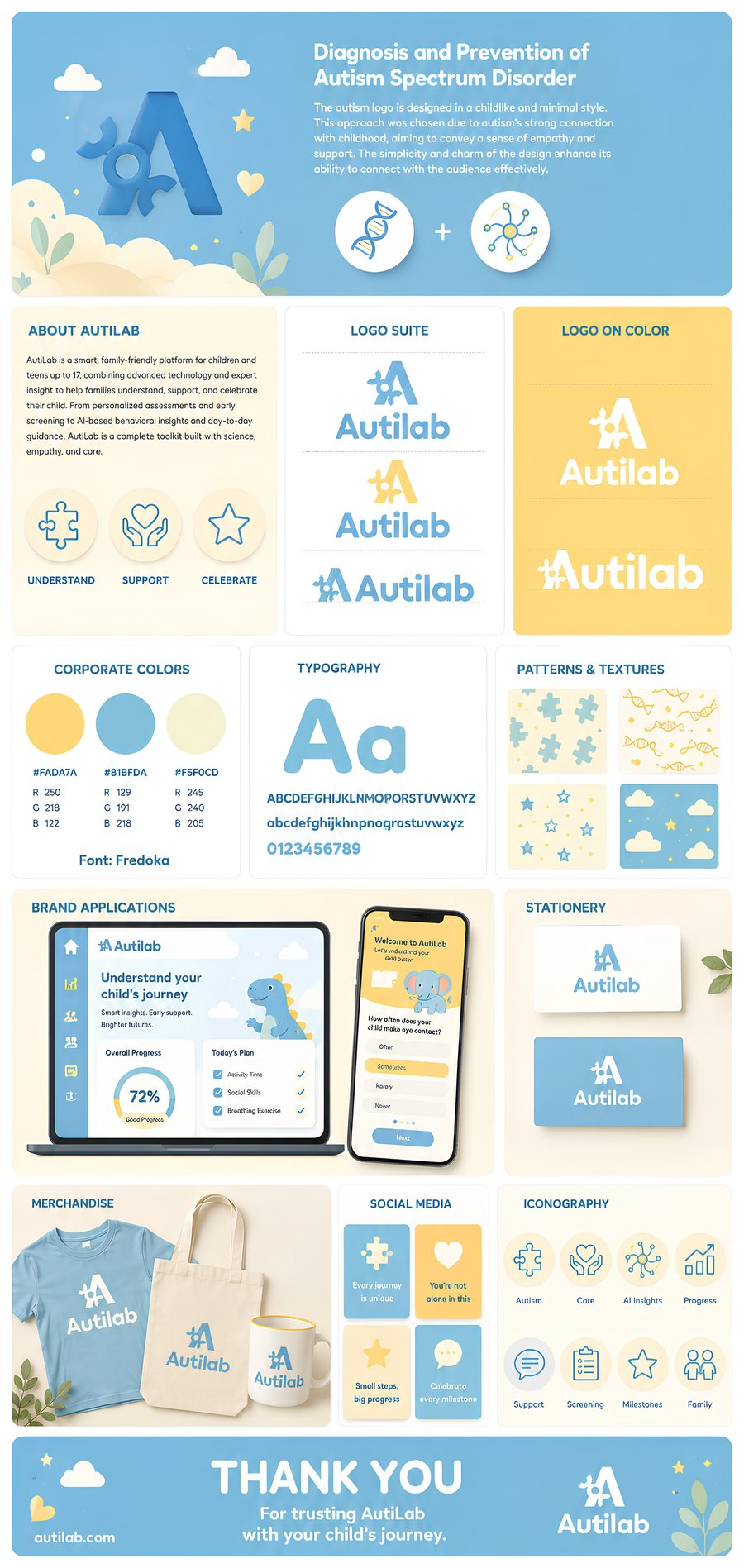
The mission, distilled into one clear paragraph.
Color variations of the mark for every background.
A stress-test of the logo on the brand's own palette.
The exact palette, locked to hex and RGB values.
The typeface that carries the brand's voice.
Reusable motifs that extend the identity beyond the logo.
The system in action, inside a real product UI.
Everyday collateral, scaled to functional formats.
Apparel and print goods, testing the mark off-screen.
Ready-made post templates with a consistent voice.
A unified icon set for a coherent interface.
The closing note — where the system signs off with warmth.
01 / 12
 PREVENTIGENE
Every logo we design sits on a geometric grid — proportion, clear space and a minimum size are decided before a single curve is drawn. That's why it still reads at 16px and still holds up at three stories tall.
Two real projects, two color systems. Click a swatch to see why that color earned its place.
Depth and authority — the color of institutional trust and serious research.
Clarity and momentum — technology that feels open, not cold or corporate.
The night sky itself — deep space, mystery, and wonder for young explorers.
A spark of discovery — the warmth of a star against the dark, always inviting curiosity.
Playful but credible — friendly enough for age 6, trustworthy enough for age 14.
A soft neutral that keeps the whole system from feeling too heavy for kids.
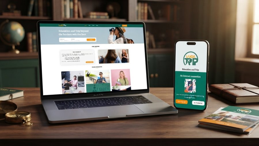
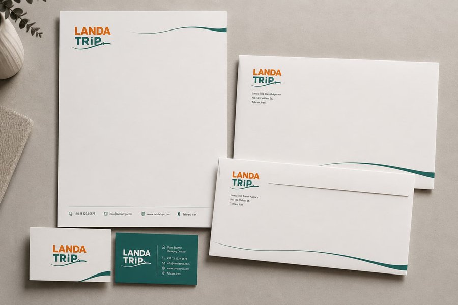
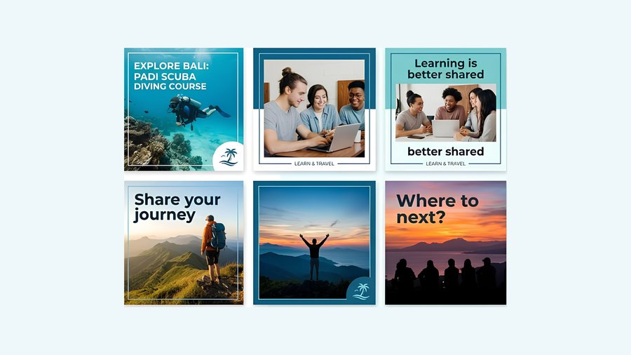
Explore the unified brand system across digital web applications, executive print stationery, social campaign grids, and vector iconography.
We learn the business, the market and who the identity actually needs to convince.
Concepts, then refinement — logo, palette and type developed together, not in isolation.
Every file, every format, and a guideline doc — ready to hand to a printer, a developer or a new hire.
A few things founders usually ask before starting.
Yes — especially early. A clear identity makes every investor conversation, hire and early customer interaction easier, and it's cheaper to build it right the first time.
Yes. Strategy defines your positioning and message. Visual identity is how that strategy looks. We offer both — see Brand Strategy if you need to start there first.
Yes. We audit what's working and what isn't, and rebuild around a clear direction rather than changing things for the sake of it.
Yes — full source files, a usage guideline document, and everything needed to hand off to an internal team or future hire.
Most identity projects run 3–5 weeks depending on scope. We'll give you an exact timeline after the discovery call.
Share where your brand is today and where it needs to go. We'll recommend the right identity scope and reply within one business day.
